 "Haimatox" (haimatox)
08/28/2014 at 11:51 • Filed to: None
 1
1
 13
13|
"Haimatox" (haimatox)
08/28/2014 at 11:51 • Filed to: None | 1
| 13 |
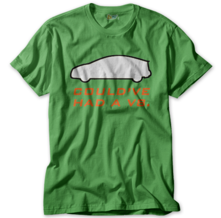
Here's the final (maybe) iteration of my Prius Could've Had a V8 Blipshift shirt. The most popular (and not by a lot) color was Ethylene Elycol Green. However, at the suggestion of my sister, along with a few of you Opponauts, I have changed the color of the words from yellow to orange. Any thoughts on the word color change? I am still not sure what color I should use. I apologize if I did not choose your color of choice.
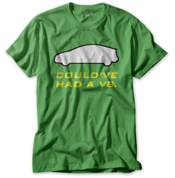
The shirt before.
The shirt now.
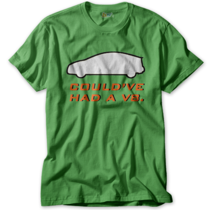
EDIT: I think that the orange is somewhat difficult to see, so I made a slight modification and added in a faux shadow to make it "pop" more.
Thoughts?
 William Byrd
> Haimatox
William Byrd
> Haimatox
08/28/2014 at 11:43 |
|
That's excellent.
Although I think the yellow is easier to read.
 Scary__goongala!
> Haimatox
Scary__goongala!
> Haimatox
08/28/2014 at 11:44 |
|
I like the newer version more
|
Haimatox
> William Byrd
08/28/2014 at 11:44 |
|
I was told that the yellow was a strange color to go with the green shirt... I don't know who to listen to hahaha.
 thebigbossyboss
> Haimatox
thebigbossyboss
> Haimatox
08/28/2014 at 11:44 |
|
Yellow better. No period needed.
 brian1321
> Haimatox
brian1321
> Haimatox
08/28/2014 at 11:46 |
|
You can leave the orange but you need to border the text to make it easier to read. Border it or do something else to bring it off the shirt.
Also, IMO yellow looks better because it reminds me of a ninja turtle for some reason.
|
Haimatox
> thebigbossyboss
08/28/2014 at 11:46 |
|
My sister said that the yellow doesn't go with the green... So confusing.
|
thebigbossyboss
> Haimatox
08/28/2014 at 11:49 |
|
Your sister lies!
|
William Byrd
> Haimatox
08/28/2014 at 11:55 |
|
I liked the edited orange. Nice.
 Chris_K_F drives an FR-Slow
> Haimatox
Chris_K_F drives an FR-Slow
> Haimatox
08/28/2014 at 12:03 |
|
I'm gonna go ahead and disagree...
 davesaddiction @ opposite-lock.com
> thebigbossyboss
davesaddiction @ opposite-lock.com
> thebigbossyboss
08/28/2014 at 12:05 |
|
Yup - drop the period.
 Little Black Coupe Turned Silver
> Haimatox
Little Black Coupe Turned Silver
> Haimatox
08/28/2014 at 12:09 |
|
Clearly you don't live in WI...
 shpuker
> Haimatox
shpuker
> Haimatox
08/28/2014 at 12:15 |
|
I like it. Might look better with the car filled with the shirt color. Like the idea though
 vicariousILive
> Haimatox
vicariousILive
> Haimatox
08/28/2014 at 12:47 |
|
red is the complimentary color to green I think that would look good. Either way kick ass shirt, I will totally buy it